Automotive design systems · Stellantis
Vehicle Interface Design System
Two design systems I built from zero for all 14 Stellantis brands: one for the instrument cluster behind the steering wheel, one for the head-up display (HUD) on the windshield.

The company
Stellantis is one of the world’s largest automakers, formed in 2021 when FCA and PSA merged. It builds cars for 14 brands. Every one of those brands needs its own look on the same screens inside the car.
Jeep · Ram · Dodge · Chrysler · Peugeot · Citroën · Fiat · Alfa Romeo · Maserati · Opel · Vauxhall · Lancia · DS · Abarth
- The problem
- There was no design system for the instrument cluster or the head-up display. Designers, UX engineers and developers built every screen by hand, for 14 brands.
- What I did
- I designed both architectures from scratch: token tiers, sizing rules from hardware and ergonomics, and brand themes. Now I lead the team and ship a release every sprint through a pipeline we own.
- What changed
- Faster design to production on every vehicle program, more consistent quality across brands, and development that can be automated.
- components and 2,600 variables in the cluster system
- 400+
- components and 650+ variables in the HUD system
- 75
- vehicle programs on the cluster system so far
- 6
- UX designers work in the cockpit design systems, close to 500 people in all
- 160
01The problem
No design system, so every screen was built by hand
When I started in March 2023, there was no design system for the instrument cluster (the screen behind the steering wheel, with speed, warnings, gear and range) or the head-up display (HUD, which projects driving information onto the windshield).
Designers, UX engineers and developers built every screen by hand, for 14 brands. Each team specified the same elements its own way, so quality drifted, and size problems were caught late, at ergonomics review.
The system had to work for any brand, any screen, any panel hardware and any viewing distance, without a separate copy for each brand.
02Working model
Try it: a working model of the system
The production files are under NDA, so I rebuilt the system’s logic as a simplified working model in a 3D cabin, with the same tokens, sizing rules and brand themes. I designed and directed it, and built it with Claude Code.
Switch the brand, then the screen, then the viewing distance. Nothing is redrawn: the components stay the same, and only token and hardware values change.
03Sizing
Sizes come from the driver’s seat, not from a mockup
Panels change by vehicle program and supplier, and drivers read them from a known distance. So each screen is described by its hardware: size, resolution and viewing distance. With ergonomics engineers, I turned the minimum text and icon sizes for that distance into tokens.
The center, portrait, passenger and rear screens are touch screens, so they also get minimum touch areas: a larger one for controls used while driving, like temperature, and a smaller one for the rest. The cluster and the HUD aren’t touched, so they have none.
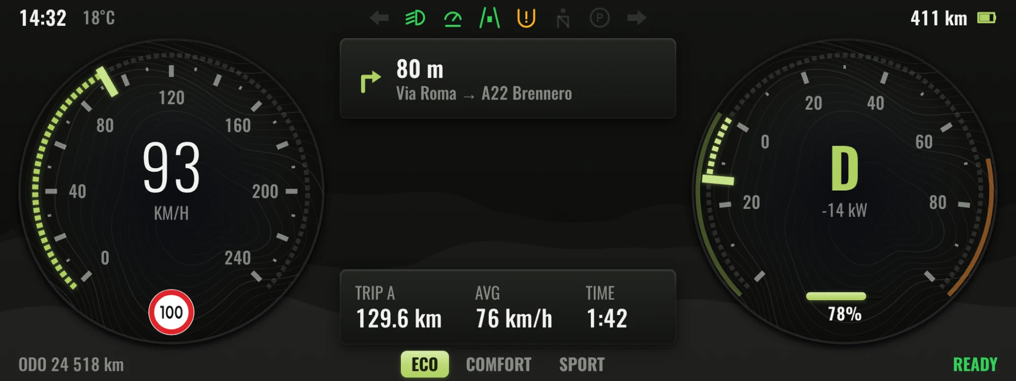
min text size comes from distance,
not from a mockup. here: 32 px
needle shape is a brand token (Jeep: a bar)
12.3″ · 1920 × 720 · 167 ppi · read from 0.75 m
- min text size comes from distance,
not from a mockup. here: 32 px - needle shape is a brand token (Jeep: a bar)
- 12.3″ · 1920 × 720 · 167 ppi · read from 0.75 m
- result
- Minimums are met before any review, and a new panel is a hardware entry, not a redesign.
- instead of
- Designing each display of each program as its own screens, with designers checking minimum sizes by hand.
- trade-off
- More specification up front, and the rules had to be agreed with ergonomics before design started.
The steering wheel decides where critical items go
The rim, spokes and hub of the wheel hide parts of the cluster, and what they hide depends on the driver’s height. Each program defines a visibility curve: the area every driver can see. In the system it is a layout input, so speed, warnings, gear and range always sit inside it.
Engineers check a range of eye heights, usually from a small woman (5th percentile) to a tall man (95th percentile).
4 of 4 critical items visible
Speed, warnings, gear and range sit inside the curve, so every driver in the range sees them. Media and navigation take the areas some drivers lose.
Switch to the fixed layout and move the eye point: some drivers lose critical items behind the wheel.
04Tokens
Brands are themes on one library, not copies
Design tokens are named values, like a color or a size, that components read instead of fixed values. Every brand is a set of tokens on one shared component library, with dark and light themes. No brand gets its own copy of a component.
Values flow one way: a brand’s raw values, then their meaning (like accent or caption), then pixels for each display. Components read only that last step, never a brand value. A few signature tokens carry what makes a brand recognizable: needles, dial faces and numerals.
- result
- A fix lands once and reaches every brand. A new brand is a new token set.
- instead of
- A library per brand: faster for the first brand, then the copies drift and every fix is made again.
- trade-off
- Brands can’t redraw components, and there are more tokens to name, govern and teach.
What a brand can change, and what it can’t
My system is the core theme. The brand UI development team themes it for each brand with my tokens, so the structure itself has to say what a brand may change. Semantic tokens are brandable. Responsive display tokens are not: they come from each screen’s size, resolution and viewing distance.
Brandable
Primitive, semantic and signature tokens
Themed per brand by the brand UI development team, on my core theme
- color.accent
- brand hue
- type.numeral
- brand typeface
- gauge.needle
- brand signature
Not brandable
Responsive display tokens
Set by each screen’s size, resolution and viewing distance; the same for every brand
read from 750 mm
- display.unit
- 1 dp = 2.91 px
- text.min
- 32 px
- icon.min
- 57 px
Component tokens read from both, so a brand changes how a screen looks, never how legible it is.
Names say what a value is for
With 2,600 variables in the cluster system, every name follows one order, from general to specific, and describes purpose, not looks. That lets designers, developers and AI tools find the right token. The sprint audit, one of the AI skills I designed in Figma, checks naming every sprint. See the skills →
Pattern display.component.element.property
- clusternamespace
- gaugecomponent
- needleelement
- colorproperty
The needle color of the cluster gauge. It points to a semantic token, never to a brand value.
One name, resolved for each mode. Options that don’t change this token are off.
tokens.json · Jeep · dark · any display
{
  "cluster.gauge.needle.color": {
    "$type": "color",
    "$value": "{color.accent.default}",
    "resolved": "#afd161"
  }
}
Components follow the same order in the Figma library, and variants become properties instead of new names.
05Partners & 3D
Past our own screens: partner platforms and 3D
The system reaches further than the screens my team designs. For partner platforms and supplier projects, I supplied design system guidance and tokens, so their experiences sit naturally in our cockpits, and I joined working sessions with their teams to check builds against the system.
Source
Cockpit design system
Tokens, components and rules, released every sprint
- Phone projection
color.surfacetype.bodyradius.container - Supplier platforms
color.accentspace.200size.touch.primary.min - Partner projects
brand themesicon setsizing rules
Working sessions with partner teams, checking their builds against the system together.
Token names are illustrative.
Clusters mix a live 3D scene with flat 2D interface. With the 3D development teams, I decided which layers render in 3D and which stay 2D, designed the components for that split, and set tokenized positions and sizes so every layer lines up pixel-perfect on each panel. Pick a layer to see what it holds.
Tokenized position and size
layout.gauge.left.x = 96 pxsize.gauge.dial = 420 pxlayout.telltale.row.y = 24 px
Values are illustrative; each panel gets its own, pixel-perfect.
06Leadership
Growing the team and strengthening the handoff
As the system grew, three designers joined the team. I onboarded them to the architecture and continue to lead the team. I shape the roadmap with leadership and support the other cockpit design system teams (center, portrait, passenger and rear screens), so the systems evolve together.
A key decision: an internal handoff pipeline
01Context
Design data reached development through an external tool the team had adopted before I took on the lead role.
02Issue
The tool kept the design data outside our control, so checking and automating the handoff was harder than it needed to be.
03Approach
I proposed an internal pipeline that the team owns and can automate end to end, aligned stakeholders on it and guided the team through the move.
04Outcome
The external tool was retired. Each sprint, the Figma libraries, the GitHub repository and the asset resources are released together, and suppliers build from that single release.
The release, every sprint
Figma libraries
Components and variables
GitHub repository
Versioned tokens, which I manage
Asset resources
Released with both
Supplier builds
Checked against the release
07Results
What changed, and what I learned
The system is transversal: built to serve all 14 brands, and already in use across six vehicle programs. Programs now build their screens from one library instead of by hand, so design reaches production faster. One source of components and variables keeps quality consistent across brands, and because the variables were structured for code from the start, development could be automated.
- Instrument cluster
- 400+components
- 2,600variables
- 6screen sizes
- 6vehicle programs
- 38teams
- Head-up display
- 75components
- 650+variables
- 8teams
What I learned
Measure a system by the manual work it removes
Every team was already doing this work by hand. The manual step a component or rule removes is how I rank the roadmap.
Structure for code from the first variable
Agreeing on the variable structure with developers early is what later made automation possible.
Teach the architecture, not only the components
The system grew past one person because the designers who joined understand why it is built this way.